- Previous message: Philippe Verdy: "Re: When do you use U+2024 ONE DOT LEADER instead of U+002E FULL STOP?"
- In reply to: Philippe Verdy: "Re: When do you use U+2024 ONE DOT LEADER instead of U+002E FULL STOP?"
- Next in thread: Jim Allan: "Re: When do you use U+2024 ONE DOT LEADER instead of U+002E FULL STOP?"
- Messages sorted by: [ date ] [ thread ] [ subject ] [ author ] [ attachment ]
- Mail actions: [ respond to this message ] [ mail a new topic ]
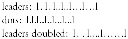
Investigating some fonts, I found in a version of Adobe Garamond Pro
the U+2024 ONE DOT LEADER glyph being a dot symmetrically preceded
and followed by a tiny space.
In the same font, the U+2026 HORIZONTAL ELLIPSIS glyph has a tiny
space (smaller than in the U+2024 glyph) before each of the three
dots and after the last one. Additionally there is a considerable
space between the single dots. Thus, that glyph is wider than
three consecutive U+002E glyphs of the same font. Microsoft's Times
Roman behaves similar for U+2026/U+002E (but contains no U+2024).
The U+2025 TWO DOT LEADER in Adobe Garamond Pro has no space between
the two dots. The pair is symmetrically enclosed by a tiny space
smaller than at U+2024.
The glyphs seem to be optimized for special typesetting needs rather
than for general punctuation (confirming other information given in
this thread).
See the attached GIF.
- Karl
- text/plain attachment: leaders.txt
- Next message: Karl Pentzlin: "Re: Fw: Unicode filename problems"
- Previous message: Philippe Verdy: "Re: When do you use U+2024 ONE DOT LEADER instead of U+002E FULL STOP?"
- In reply to: Philippe Verdy: "Re: When do you use U+2024 ONE DOT LEADER instead of U+002E FULL STOP?"
- Next in thread: Jim Allan: "Re: When do you use U+2024 ONE DOT LEADER instead of U+002E FULL STOP?"
- Messages sorted by: [ date ] [ thread ] [ subject ] [ author ] [ attachment ]
- Mail actions: [ respond to this message ] [ mail a new topic ]
This archive was generated by hypermail 2.1.5 : Sat May 31 2003 - 07:03:47 EDT