- Previous message: Asmus Freytag: "Re: Control picture glyphs (was Re: Apostrophes at www.unicode.org)"
- Maybe in reply to: James Kass: "Control picture glyphs (was Re: Apostrophes at www.unicode.org)"
- Messages sorted by: [ date ] [ thread ] [ subject ] [ author ] [ attachment ]
- Mail actions: [ respond to this message ] [ mail a new topic ]
First of all, let me assure everyone that I'm not advocating that all
fonts contain control pictures for all control characters.
If I were writing an application per Asmus Freytag's outline, I would
probably employ his suggestion and ship a special font along with
the application.
But, I'm not writing such an application and do not expect that all
of the control characters in Unicode should be displayable using the
fonts that I *do* develop.
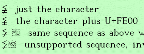
Let's consider a specific variation selector sequence.
U+2268 LESS THAN BUT NOT EQUAL TO
--plus--
U+FE00 VARIATION SELECTOR-1
≨ just the character
≨︀ the character plus U+FE00
≨ ︀ same sequence as above with space inserted
≨︁ unsupported sequence and/or invalid sequence.
Why is a display such as the one shown in the attached screen
shot so undesirable?
This works in Notepad, a plain text editor, on Windows XP
right out-of-the-box.
Of course it works in BabelPad. It should work in any
plain text editor on any system supporting OpenType.
(With any font which supports the sequences and includes
its own control pictures for the VS characters.) Copy/paste
from the above and try it to see! Insert or delete the space
and witness the magic of OpenType.
The control picture disappears when the sequence is valid. The
glyph for the control picture is no longer part of the glyph
stream, and its advance width is discarded by the rendering
engine. It certainly doesn't affect the display in the default
display mode. (And in Notepad, the default display mode is
the only display mode. Except for word-wrap.)
Best regards,
James Kass
P.S. - It is, indeed, possible that two font developers might choose
the same glyph to serve as a control picture for two vastly different
characters. But, it does strike me as being unlikely. The benefits
of being able to simulate a "show hidden" mode in a plain text
editor in certain cases (specifically VS) by inserting spaces between
characters in a sequence far outweigh any risks, my opinion.
Additionally, I get a reasonable display in the plain text editor for
VS characters in isolation. In the HTML browser, I get reasonable
control picture glyphs (for VS characters) in HTML Unicode charts.
In character map applications, I get reasonable control picture glyphs
(for VS characters), too.
-----Original Message-----
>From: Asmus Freytag <asmusf@ix.netcom.com>
>Sent: Aug 26, 2007 11:22 AM

- Next message: Peter Constable: "RE: Control picture glyphs (was Re: Apostrophes at www.unicode.org)"
- Previous message: Asmus Freytag: "Re: Control picture glyphs (was Re: Apostrophes at www.unicode.org)"
- Maybe in reply to: James Kass: "Control picture glyphs (was Re: Apostrophes at www.unicode.org)"
- Messages sorted by: [ date ] [ thread ] [ subject ] [ author ] [ attachment ]
- Mail actions: [ respond to this message ] [ mail a new topic ]
This archive was generated by hypermail 2.1.5 : Sun Aug 26 2007 - 16:18:37 CDT