Date: Thu, 7 Jun 2012 16:30:39 +0200
On Thu, Jun 7, 2012 at 12:39 AM, Karl Pentzlin <karl-pentzlin_at_acssoft.de> wrote:
> Am Mittwoch, 6. Juni 2012 um 09:55 schrieb Szelp, A. Sz.:
>
> SAS> Michael wrote:
> SAS> "As I say, stretched x is in a family of other x's with one or two
> SAS> long feet, which may have rings or hooks on the end of them. But its
> SAS> weight is clearly x-like -- by design. Where Teuthonista texts
> SAS> occasionally used a "proper" Greek chi it is because of typographic
> SAS> deficiency."
>
> I second this. The real lower case Latin chi (used for IPA and for
> some North American Indigenous orthographies) will show curves on the
> upper left and lower right terminations like its uppercase
> counterpart, which has to show such in any case to be distinguishable
> from an uppercase Latin X.
> The stretched x will look just like its name says, as it (as Michael
> said) has to be in line with other related characters.
The only examples of stretched-x are in italic serif form below
baseline (like Lepsius' chi) in SBS and others, in roman sans-serif
form taller than x-height (like capital X) in SMF and others, and like
chi (mostly italic). We all assume the stretched-x like capital X is
bad typography.
Italic Didot has x like ɔc, others fonts have x like a shortened chi
with those curves you describe, and others simply have two crossing
lines. X is very much related with chi in the first place. It should
be no surprise for Latin chi to be related to both or either Greek chi
or x depending on the font.
> The fact that the italic forms in some fonts may look similar
> is no argument for an unification, otherwise U+0066 LATIN SMALL LETTER F
> and U+0192 LATIN SMALL LETTER F WITH HOOK had to be regarded as being
> the same letter also.
F and f with hook clearly appear as distinctive letters in the same
text. Latin chi and stretched-x do not.
>
> It is also very likely that the Latin chi and the stretched x will be
> used in the same environment. Both are phonetic letters, and are
> likely to occur in the same texts especially when somebody presents
> their transcription of Teuthonista sources into IPA.
> This means that fonts designed for dialectology, containing
> Teuthonista characters, usually will contain IPA characters also.
> Thus, if the stretched x were unified with the chi, the design of the
> stretched x would be fixed to the chi design, preventing it from
> being designed in line with the other x forms (or, even worse, invite
> the designer to make the other x forms inappropriately "chi-like").
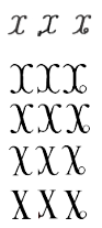
No, a Latin design of chi is totally suitable for the Teuthonista/SBS
appendices. I've attached an image showing the various possibilities
under the italic glyphs from SBS. All have the distinguishable
features needed to represent the sounds. These are as original as the
roman glyphs that were proposed.
> SAS> ... but it's Michael himself who's recognized that
> SAS> "Teuthonista suffers from a good deal of extraordinarily bad
> SAS> typography" ...
>
> This, however, is no excuse for continuing such bad typography into a
> bad encoding which would carve in stone such a bad typography forever.
>
I agree, we should avoid bad typography. But isn't a Latin chi (the
IPA Latin chi being proposed) with Greek weights instead of Latin
weights bad typography? Probably, that glyph still doesn't blend in
with other Latin glyphs.
If Teuthonista (late 1800s, and most of 1900s) was using bad
typography by using chi instead of stretched-x before SBS's low serif
or low ring (in last 2 decades), can't we same the same with IPA, and
should IPA also start using stretched-x? Obviously not, and arguably
Teuthonista has been using Latin chi properly too (but only with the
Greek glyph until SBS).
--
Denis Moyogo Jacquerye