- Previous message: Erik van der Poel: "Re: Security Issues"
- In reply to: Philippe Verdy: "Re: 'lower case a' and 'script a' in unicode"
- Maybe reply: Philippe VERDY: "Re: Re: 'lower case a' and 'script a' in unicode"
- Messages sorted by: [ date ] [ thread ] [ subject ] [ author ] [ attachment ]
- Mail actions: [ respond to this message ] [ mail a new topic ]
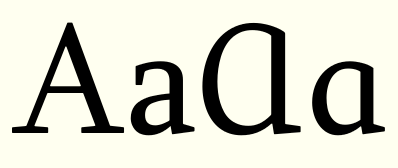
Philippe Verdy wrote:
> So there would be some uppercase version that could look like a
> uppercase A with the top rounded instead of angled, i.e. similar to a
> turned U with a bar.
> Or a form like a OC ligature, i.e. a bigger Greek small alpha.
In the version of the Sylfaen typeface that I made for MS in 1998, I used a larger version
of the lowercase form. See small attached graphic.
I think the characterisation 'like an OC ligature' is misleading, because the amount of
curvature on the right side of either upper or lowercase is stylistic (this is true of the
lowercase Greek alpha also).
John Hudson
--
Tiro Typeworks        www.tiro.com
Vancouver, BC        [email protected]
Currently reading:
A century of philosophy, by Hans Georg Gadamer
David Jones: artist and poet, ed. Paul Hills
- Next message: Shawn Steele: "RE: Languages of the world"
- Previous message: Erik van der Poel: "Re: Security Issues"
- In reply to: Philippe Verdy: "Re: 'lower case a' and 'script a' in unicode"
- Maybe reply: Philippe VERDY: "Re: Re: 'lower case a' and 'script a' in unicode"
- Messages sorted by: [ date ] [ thread ] [ subject ] [ author ] [ attachment ]
- Mail actions: [ respond to this message ] [ mail a new topic ]
This archive was generated by hypermail 2.1.5 : Thu Mar 24 2005 - 13:45:06 CST