- Previous message: Peter Constable: "RE: Display of Mongolian in Arabic or Hebrew documents"
- Maybe in reply to: Eric Muller: "Re: Display of Mongolian in Arabic or Hebrew documents"
- Messages sorted by: [ date ] [ thread ] [ subject ] [ author ] [ attachment ]
- Mail actions: [ respond to this message ] [ mail a new topic ]
[Resending with only one attachment as the original message does not
seem to have got through]
> From: vunzndi@vfemail.net [mailto:vunzndi@vfemail.net]
>
> ... Whislt there are some examples of horizontal runs of Mongolian in
> Chinese text, horizontal is not the norm. The norm is for words to be
> vertical even though the sentances maybe be horzontal...
I'm not sure that this is the case. In my experience, in academic
books and journals, horizontal embedding is most common. Of course, in
special situations, such as on banknotes, postage stamps and for
company logos, care may be taken to display Mongolian text in its
natural vertical orientation, but I don't think that you can really
compare a banknote design with computer text.
In Prof. Choijinzhab's book on Mongolian Encoding, Menguwen Bianma
蒙古文编码, he mixes horizontal and vertical embedding, with individual
letters and short words orientated vertically, and long words
orientated horizontally, as can be seen from this example:
<http://www.babelstone.co.uk/MGWBM/MGWBM_C106-C107.jpg>
Clearly, a decision has been made only to embed Mongolian text
vertically if it is short enough to fit in without expanding the
horizontal line spacing, which I think is a reasonable typographic
decision to make.
The important thing to realise is that we can already achieve vertical
embedding (or mixed vertical and horizontal embedding) of Mongolian
words in horizontal Latin or Chinese text using rich text (e.g. CSS),
As an example I have just typed out a short extract from the above
page from Prof. Choijinzhab's book, showing both horizontal and
vertical Mongolian embedded in horizontal Chinese, and formatted it as
an HTML document. When rendered by Internet Explorer (under XP) with
the Mongolian Baiti font (see attached "RichText.jpg") it looks
perfectly OK to me, and I truely do not know what the fuss is all
about.
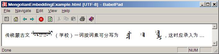
The fact that in a plain text editor Mongolian text is always laid out
horizontally (see attached "PlainText.jpg") does not bother me in the
slightest, and I agree wholeheartedly with Peter that the
disadvantages of having vertical Mongolian layout in a horizontal
plain text context far outweight any perceived advantages.
Andrew
- Next message: Peter Constable: "RE: Ol Chiki character name typo?"
- Previous message: Peter Constable: "RE: Display of Mongolian in Arabic or Hebrew documents"
- Maybe in reply to: Eric Muller: "Re: Display of Mongolian in Arabic or Hebrew documents"
- Messages sorted by: [ date ] [ thread ] [ subject ] [ author ] [ attachment ]
- Mail actions: [ respond to this message ] [ mail a new topic ]
This archive was generated by hypermail 2.1.5 : Tue Nov 27 2007 - 09:15:31 CST